-
Notifications
You must be signed in to change notification settings - Fork 269
New issue
Have a question about this project? Sign up for a free GitHub account to open an issue and contact its maintainers and the community.
By clicking “Sign up for GitHub”, you agree to our terms of service and privacy statement. We’ll occasionally send you account related emails.
Already on GitHub? Sign in to your account
New look and funcions for editor and quick override fix #74
base: main
Are you sure you want to change the base?
Conversation
|
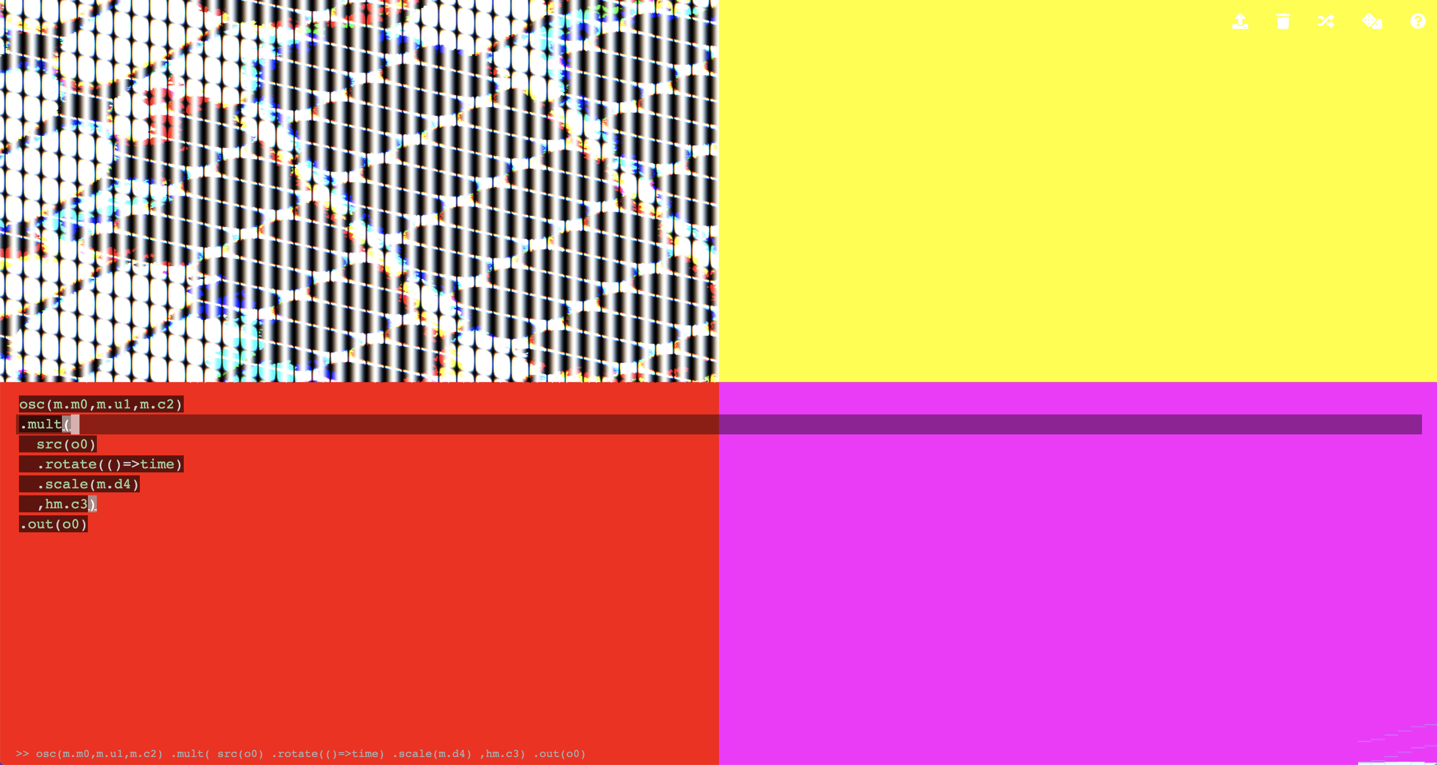
Hi, I really like the highlighting of brackets and auto close brackets! Some changes before merging this:
There are some style things that are too heavy handed for me. It is complicated in hydra because there is a trade off between readability and blocking the visuals.:
I really like the line highlighting, but I think it can be really intrusive. A lot of ppl perform with hydra by making the code really small in a large window, and this would cause a line across the whole screen. I would be interested in just highlighting the line in the left hand gutter. I think the bracket highlighting could be a more muted grey to not get so confused with the cursor. Maybe this is a good chance to think about allowing custom theming and editor configuration, because I am sure ppl will have different preferences in different scenarios. |
|
Hey @ojack , thank you for the feedback. I made up changes and used the left hand gutter to highlight selected line. If necessary I can rollback to no selected line highlight as before :) |

Hi Olivia,
thank you for your wonderful synth.
I'd like to propose few changes to the editor, obviously is just a proposal and if necessary I can change my edits or cancel the pull request.
And a fix to keydown listener:
Here a screenshot of the editor with these changes:
